On-chain data lets you see what is actually happening on a blockchain — wallet movements, exchange flows, network activity — rather than relying on price charts alone. Tools like Glassnode, Nansen, and Dune Analytics provide metrics such as active addresses, NVT ratio, and MVRV that reveal whether a cryptocurrency is undervalued, overbought, or losing user interest. This guide walks through the key metrics and how to build an analysis workflow from them.
In This Article
- What Is On-Chain Data and Why Does It Matter?
- Which On-Chain Metrics Should You Track First?
- How Do Active Addresses Reveal Real Adoption?
- What Tools Can You Use for On-Chain Analysis?
- How Do You Build a Practical On-Chain Analysis Workflow?
- What Are the Limitations of On-Chain Analysis?
- Frequently Asked Questions
On-chain analysis is the closest thing crypto has to reading a company’s financial statements. Price tells you sentiment. On-chain data tells you fundamentals. If you want a broader framework for evaluating any cryptocurrency, start with our guide to researching crypto before buying.
What Is On-Chain Data and Why Does It Matter?
On-chain data is information recorded directly on a blockchain’s public ledger — every transaction, wallet balance, smart contract interaction, and validator action. Unlike exchange data or social media sentiment, on-chain data cannot be faked because it is cryptographically verified by the network itself. This makes it the most reliable source of fundamental analysis in crypto.
Traditional financial markets have SEC filings, earnings reports, and audited balance sheets. Crypto has the blockchain. According to Glassnode, their platform tracks over 200 on-chain metrics across major blockchains. The advantage is radical transparency — you can verify claims about adoption, usage, and token distribution without trusting anyone.
Which On-Chain Metrics Should You Track First?
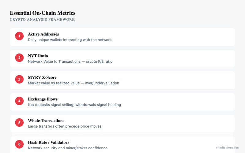
Start with five core metrics: active addresses, transaction count, NVT ratio, MVRV ratio, and exchange net flows. These give you a complete picture of network health, valuation, and market positioning. Each metric answers a different question about the asset you are evaluating.
| Metric | What It Measures | Bullish Signal | Bearish Signal | Free Source |
|---|---|---|---|---|
| Active Addresses | Unique wallets transacting daily | Sustained increase | Declining while price rises | Blockchain explorers |
| NVT Ratio | Network value relative to transaction volume | Below 25 | Above 150 | Glassnode (limited free tier) |
| MVRV Ratio | Market cap vs. realized cap | Below 1.0 | Above 3.5 | CryptoQuant free tier |
| Exchange Net Flow | Tokens entering/leaving exchanges | Net outflows | Large net inflows | CryptoQuant, Nansen |
| Hash Rate / Stake Rate | Network security commitment | All-time highs | Sharp declines | Blockchain.com, Beaconcha.in |
The NVT ratio works like a price-to-earnings ratio for blockchains. When I last checked Bitcoin’s NVT on CryptoQuant, a reading above 100 historically preceded corrections. The MVRV ratio compares the current price to the average price at which every coin last moved — when it exceeds 3.5, most holders are in significant profit and selling pressure tends to follow.
How Do Active Addresses Reveal Real Adoption?
Active addresses count the unique wallets that send or receive at least one transaction per day, making it the simplest proxy for real user adoption. A cryptocurrency can have a high market cap — understanding what market cap actually tells you — but if active addresses are flat or declining, that valuation is not backed by growing usage.
Ethereum consistently maintains between 400,000 and 600,000 daily active addresses according to Etherscan’s address charts. Bitcoin typically runs between 600,000 and 900,000. A sudden spike in active addresses paired with rising transaction volume is the strongest on-chain signal of genuine demand rather than speculative pumping.
Watch for divergences. If price climbs but active addresses stay flat, the rally is likely driven by a small number of large holders rather than broad adoption. This pattern preceded several major corrections historically.
What Tools Can You Use for On-Chain Analysis?
The three dominant platforms are Glassnode for Bitcoin-centric metrics, Nansen for Ethereum and EVM wallet labeling, and Dune Analytics for custom queries across any blockchain with public data. Each serves a different analysis style, and you can accomplish meaningful research using free tiers alone.
Glassnode offers the deepest Bitcoin on-chain dataset available. Their free tier includes key metrics with a 24-hour delay. Paid plans start around $29 per month for real-time data. Nansen labels over 250 million wallets, letting you track what venture capital firms, exchanges, and known smart money wallets are actually doing. Dune Analytics is entirely free and lets anyone write SQL queries against blockchain data — the community has built thousands of pre-made dashboards you can use without writing code.
My opinion: Dune Analytics offers the best value for independent researchers. The community dashboards cover most common analyses, and the ability to write custom queries means you are never limited to what a platform decides to show you.
How Do You Build a Practical On-Chain Analysis Workflow?
Start with macro network health, narrow to specific metrics for your target asset, then cross-reference with exchange flow data before making any investment decision. This three-step process takes about 30 minutes per asset and catches red flags that price-only analysis misses.
Step 1: Network health check. Pull active addresses, transaction count, and fees for the past 90 days. Look for trends, not single data points. A rising fee market usually means genuine demand for block space.
Step 2: Valuation metrics. Check NVT and MVRV. If both indicate overvaluation simultaneously, that is a stronger signal than either metric alone. Compare the current readings to historical extremes for that specific chain — Ethereum’s NVT norms differ from Bitcoin’s.
Step 3: Exchange flows. Large net inflows to exchanges typically precede selling. Net outflows suggest accumulation. According to CryptoQuant’s exchange flow data, sustained outflows lasting more than two weeks have historically preceded price recoveries.
Cross-reference your findings with Bitcoin dominance trends to understand whether the signal is asset-specific or market-wide. Read more about our verification approach in our research methodology.
What Are the Limitations of On-Chain Analysis?
On-chain data shows what happened, not why it happened, and it cannot capture off-chain activity like OTC trades, centralized exchange internal transfers, or regulatory actions. Treating any single metric as a buy or sell signal without context leads to false conclusions.
Layer 2 networks and privacy technologies also create blind spots. Transactions on the Lightning Network, Arbitrum, or Optimism may not appear in Layer 1 on-chain data. Coin mixing services and privacy coins obscure wallet relationships entirely. Always check whether the metric you are reading captures the full activity of the chain you are analyzing.
Frequently Asked Questions
- Can I do on-chain analysis for free?
- Yes. Dune Analytics is fully free, blockchain explorers like Etherscan provide basic metrics, and both Glassnode and CryptoQuant offer limited free tiers with delayed data sufficient for longer-term analysis.
- Does on-chain analysis work for all cryptocurrencies?
- It works best for public blockchains like Bitcoin and Ethereum. Tokens on centralized or private chains have limited on-chain visibility. The quality of data depends on how transparent the underlying blockchain is.
- How often should I check on-chain metrics?
- For long-term investing, weekly reviews are sufficient. Active traders may check daily. The metrics move slowly compared to price, so hourly monitoring adds noise without clarity.
- Is on-chain analysis better than technical analysis?
- They answer different questions. On-chain analysis reveals fundamental network health and investor behavior. Technical analysis maps price patterns and momentum. The strongest signals come from combining both approaches.
Sources
- Glassnode On-Chain Metrics — accessed when I last checked
- CryptoQuant Exchange Flow Data — accessed when I last checked
- Etherscan Active Address Chart — accessed when I last checked
- Dune Analytics — accessed when I last checked
- Nansen Wallet Intelligence — accessed when I last checked
This article is for informational purposes only and does not constitute financial advice. Cryptocurrency investments carry significant risk. Consult a qualified financial advisor before making investment decisions.